Table of Contents
- Racial/ Ethnic Minority Status
- Median Household Income
- The History of Redlining in Hartford
- Environmental Burden
- Health Vulnerability
How are environmental and health outcomes distributed in Greater Hartford? Using U.S. Census data and resources from federal agencies, these maps demonstrate disparities in income, health vulnerability, and environmental burden, which disproportionately impact communities of color in Hartford. Historical practices like redlining have generated systemic racism that continues to impact Hartford residents as well.
To fully grasp the information presented in the maps and how they portray environmental justice, one must understand how each map interacts with the others. The first map shows the percentage of racial/ethnic minorities across census tracts, revealing a higher concentration inside the city of Hartford compared to the surrounding areas. The second map illustrates the median household income, with Hartford having a significantly lower income, particularly compared to suburbs like West Hartford. A third map, the social vulnerability map, illustrates the areas of historical redlining, where most of the city resides within formerly red or yellow-zoned districts. These zones historically denied people of color or immigrants housing loans and resources due to their race and ethnicity. The redlining map highlights how historic injustices map onto present-day racial/ethnic and socioeconomic segregation, and related environmental and health outcomes.
Indeed, the environmental burden map, drawing on data from the US Centers for Disease Control and Prevention, shows air and water pollution, potentially hazardous and toxic sites, and poor infrastructure, all disproportionately impacting the city of Hartford. Notably, the MIRA trash incinerator in the South End of Hartford, is marked on each map inside an area with a high environmental burden. The final map depicts overall health vulnerability, focusing on the rates of asthma, cancer, heart disease, and poor mental health. The maps offer striking, visual evidence of how environmental and health burdens disproportionately affect low-income communities of color in the city of Hartford. Moreover, on nearly all the maps, a large swathe of land in the northeast corner of Hartford has no data associated with it. This large section of the city represents the North End Materials Innovation and Recycling Authority (MIRA) landfill, previously under Connecticut Resources Recovery Authority’s(CRRA) control. This is a highly polluted and presently uninhabitable location, compounding the environmental harms facing city residents.
Racial/ Ethnic Minority Status
Map 1: Environmental Justice Index-Racial/Ethnic Minority Status in Hartford, CT
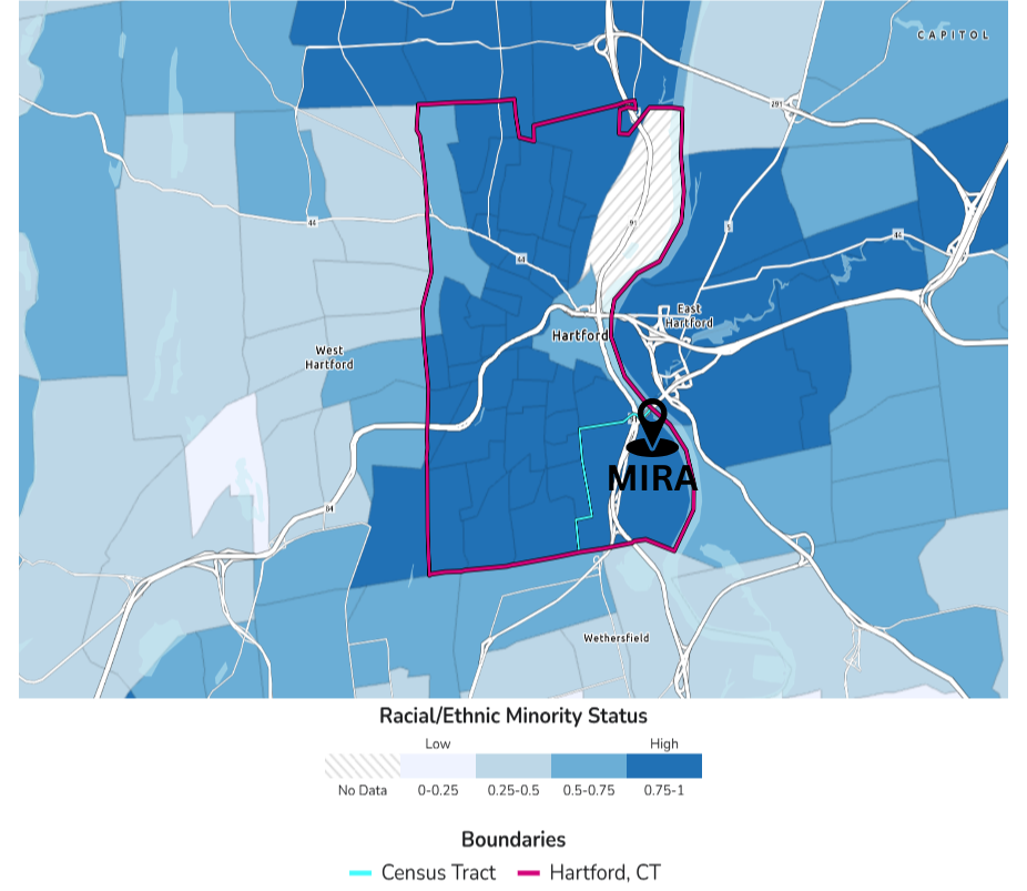
Caption: Map of the proportion of racial/ethnic minority residents in Hartford and surrounding municipalities by U.S. census tracts.
Source: Centers for Disease Control and Prevention and Agency for Toxic Substances Disease Registry. (2024) Environmental Justice Index. Accessed [04/15/25]. https://atsdr.cdc.gov/place-health/php/eji/eji-data-download.html
Description: Information from the U.S. Census Bureau’s American Community Survey from 2018-2022 was utilized to calculate each census tract’s proportion of racial/ethnic minorities. The Centers for Disease Control and Prevention categorized any individual not identified as a ‘Non-Hispanic White’ as a racial/ethnic minority. The map depicts that most census tracts in Hartford have upwards of 75% racial/ethnic minority residents.
Median Household Income
Map 2: Median Household Income in Hartford, CT, 2023
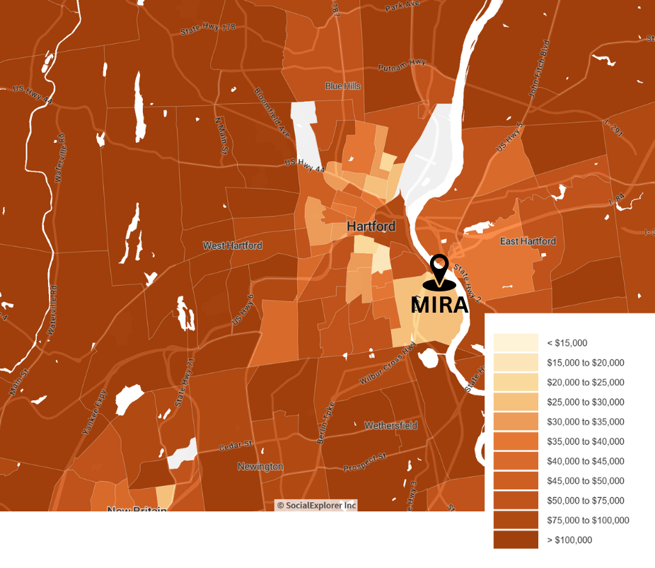
Caption: A map displaying the median household income in Hartford and the surrounding metropolitan area.
Source: U.S. Census Bureau (2023). American Community Survey (ACS) 5‑year estimates. Social Explorer. Retrieved April 2024, from https://www.socialexplorer.com/a9676d974c/explore
Description: Data from the 2023 5-year US Census American Community Survey depicts the median household income for each census block group within Hartford (outlined in blue). The MIRA waste incinerator, marked by the pin in the southeast of Hartford, is situated in one of Hartford’s lowest-income census blocks with a median income of $27,212 as of 2023, as opposed to one census block in West Hartford with a median income of $250,001.
The History of Redlining in Hartford
Map 3: The History of Redlining in Hartford
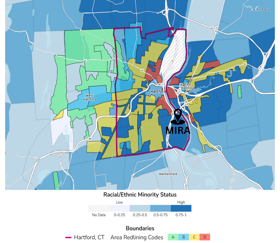
Caption: A historical redlining map of Hartford showcasing the discriminatory policies that shaped the city’s neighborhoods and continue to impact communities today.
Source: Centers for Disease Control and Prevention and Agency for Toxic Substances Disease Registry. (2024), Environmental Justice Index. Accessed 2025. https://atsdr.cdc.gov/place-health/php/eji/eji-data-download.html
Description: The redlining map of Hartford highlights the systemic segregation and racial discrimination embedded in 20th-century housing policies. Created by the Home Owners’ Loan Corporation (HOLC) during the 1930s, these maps assigned neighborhoods color-coded grades based on “risk” for mortgage lending. The four categories include: (1) Green (“best”) – affluent and predominantly white areas seen as the safest for investment. (2) Blue (“still desirable”)- stable, middle-class areas, typically white. (3) Yellow (“definitely declining”) – working-class neighborhoods, often with immigrants. (4) Red (“Hazardous) – Predominantly Black, Brown, or low-income communities were deemed high-risk and denied loans. This system, banned in 1968, has led to decades of disinvestment and inequality, which remains evident in racial/ethnic and socioeconomic segregation and related disparities in health and environmental outcomes. This map serves as a powerful visual representation of how past policies continue to shape Hartford’s environmental landscape.
Environmental Burden
Map 4: Environmental Justice Index-Environmental Burden, Greater Hartford
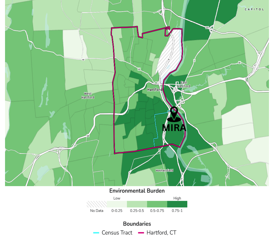
Caption: Environmental burden and potentially hazardous and toxic sites. Data sourced from the United States Center for Disease Control Agency for Toxic Substances and Disease Registry.
Source: Centers for Disease Control and Prevention and Agency for Toxic Substances Disease Registry. (2024) Environmental Justice Index. Accessed [04/15/25]. https://atsdr.cdc.gov/place-health/php/eji/eji-data-download.html
Description: This map shows the environmental burdens faced by different Hartford neighborhoods. Environmental burden is calculated by factoring in air pollution, potentially hazardous and toxic sites, built environment, transportation infrastructure, and water pollution within a given area. The Hartford South End neighborhoods face immense environmental burdens with many potentially hazardous and toxic sites, lots of built-up environment, heavy air pollution, the highway cutting through the landscape, and water pollution in the river. These areas also represent some of the poorest neighborhoods in Hartford and neighborhoods with a majority of residents of color, exemplifying the connection between race, wealth, and exposure to environmental injustices. The United States Center for Disease Control’s Environmental Justice Index ranks the Hartford South End community in the 99th percentile for environmental burdens. It is imperative when assessing the remediation plans following the shutdown of the MIRA plant to consider the impact of high exposure to numerous environmental burdens on the surrounding residents’ health and quality of life.
Health Vulnerability
Map 5: Environmental Justice Index- Health Vulnerability, Greater Hartford
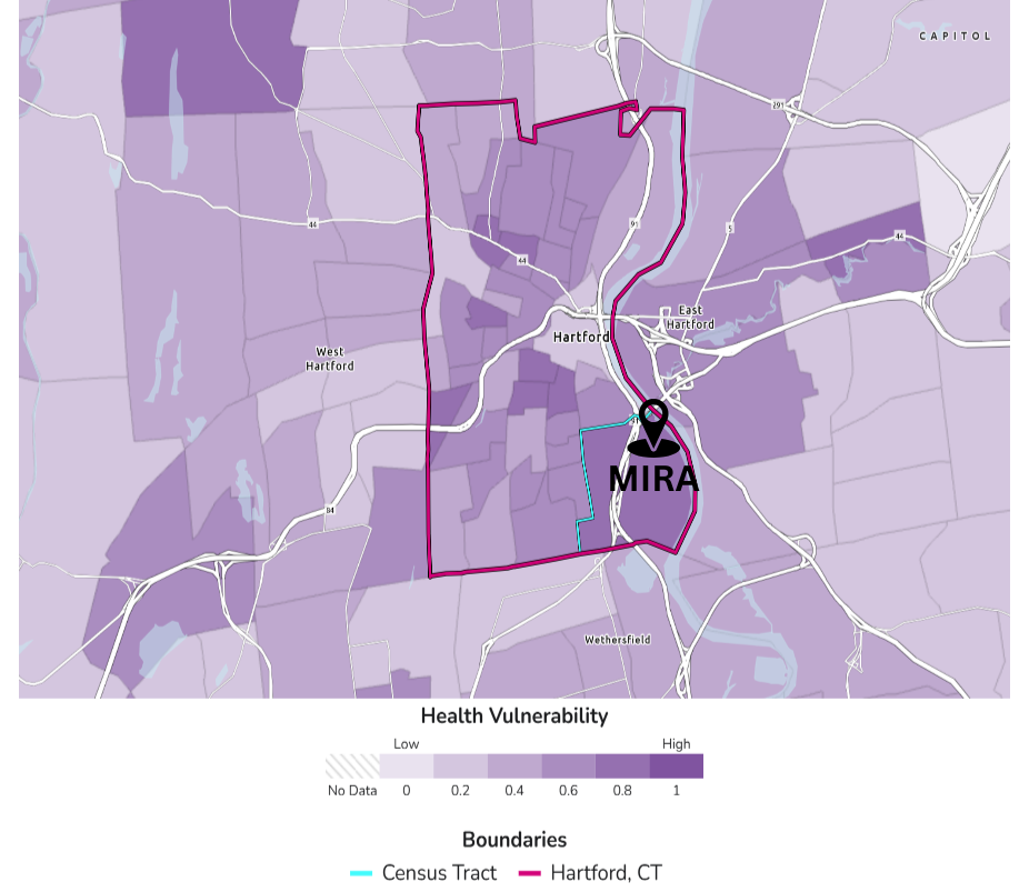
Caption: Prevalence of overall health vulnerability in adults aged 18 or older in Greater Hartford, Connecticut. Data sourced from the U.S. Center for Disease Control and Prevention’s 2024 PLACES Estimates.
Source: Centers for Disease Control and Prevention and Agency for Toxic Substances Disease Registry. (2024) Environmental Justice Index. Accessed [04/18/25]. https://atsdr.cdc.gov/place-health/php/eji/eji-data-download.html
Description: Hartford, Connecticut is known for its high health vulnerability. The city’s proximity to major state highways, combined with 30+ years of harmful emissions from the MIRA incinerator, have taken a toll on low-income communities and communities of color. This map, created using data from the U.S. Center for Disease Control and Prevention, reveals the aggregated prevalence of asthma, cancer, heart disease, and poor mental health in Greater Hartford’s census tracts. Neighborhoods in Hartford, particularly the South End where the MIRA plant is located, exhibit among the highest health vulnerability according to the legend. This visual illustrates the impact of emissions on the city and the health disparities between Hartford and the surrounding towns. The environmental justice struggle is clear, highlighting the need for meaningful remediation efforts while also emphasizing how the MIRA incinerator has perpetuated health inequalities.