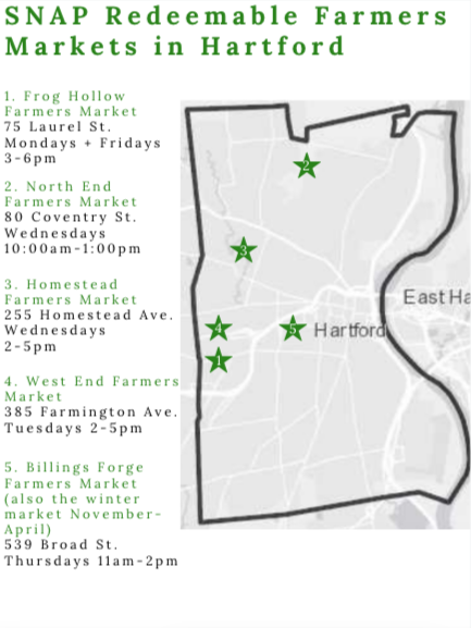
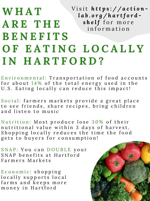
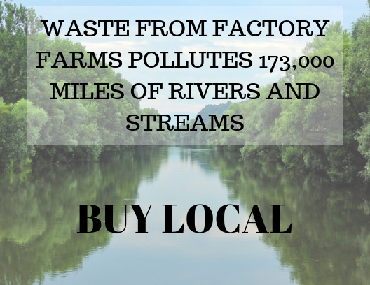
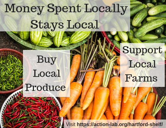
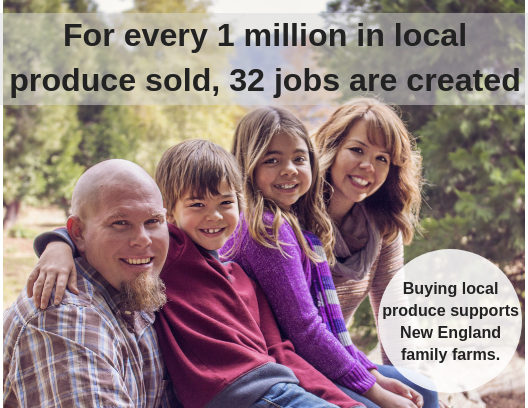
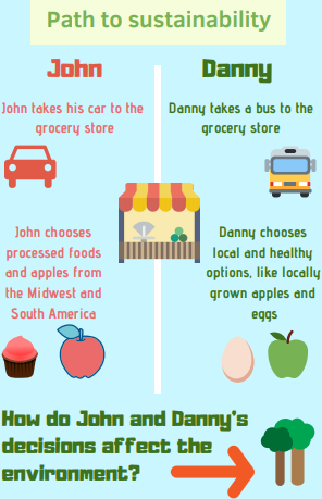
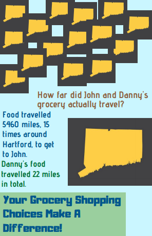
The marketing flyer survey gave us a lot of important information on what Hartford residents want to see and learn about local foods. We surveyed 30 residents with three separate flyers that we created. The three flyers all advertised the benefits of eating locally but used different marketing strategies. The concept behind flyer #1 was to provide numerous facts about the benefits of eating locally all in one place. Additionally, we also aimed to test residents’ response to a map that shows the five SNAP redeemable farmers’ markets in Hartford. Flyer #2 was designed as a set of three postcard-sized flyers with bright pictures as the background. One specific fact about a benefit to eating locally is illustrated on each individual flyer. Lastly, flyer #3 approached the advertising in a creative way by presenting a narrative story on how eating locally benefits the environment.
Flyer #1
Front:
Back:
Flyer #2 (a set of 3 flyers):
Flyer #3:
Front:
Back:
One of our primary findings was that people really liked having a tangible map of where farmers markets are in Hartford. Four of our 14 participants who chose flyer #1 as their favorite explicitly told us they liked the map.
Something else about flyer 1 participants liked was the information content. Seven of our 14 participants mentioned they like the information provided on this flyer. Flyer #1 received the highest scores for both the clarity of information and how relevant the information is to their lives.
While participants enjoyed the map, information content and clarity of flyer #1, it was clear that the visual appeal was not as strong for flyer #1 as it was on flyer #2 and #3. 4 of the 14 respondents for flyer #1 said they wish it was more visually appealing. Additionally, flyer #1 received the lowest score for the visually appealing scale. 3 of the 8 participants who voted for flyer #2 as their favorite said that they liked the colors and pictures used, and half of the participants who voted for flyer #3 as their favorite mentioned that the colors used stood out to them.

